
AZEE Branding Solutions

It’s been 32 years since Disney made hockey cool and inspired an entire generation of 90s kids to start looking to the NHL as an entertainment avenue. In 1992, Gordon Bombay was a household name, everyone knew what a knuckle-puck was, and people knew not to mess with the Bash Brothers. People believed that Greenland was covered in ice, but Iceland was very nice and the Air Bombay Loafer for kids who want to coach was presented as a rival to the Air Jordan. Okay, maybe not the last one, but a boy can dream! The Mighty Ducks movie was so widely popular that it did something that had never been done before and has never been done since: it led to a professional sports franchise being created.
Only one year later, the NHL added The Mighty Ducks of Anaheim as an official expansion franchise. Their eggplant purple and turquoise green colors were something new and exciting in a sea of traditional logos, colors, and jerseys. The team, housed a mere stones throw from Disneyland Park, gave Californians another Hockey franchise to follow, despite being an area that is far from known for it, but the branding and merchandising alone was enough to warrant it’s creation.
A Brief History of the Mighty Ducks of Anaheim
When The Mighty Ducks of Anaheim debuted in the 1993-94 NHL season, they brought a fresh and youthful energy to the league. The team’s logo, featuring a duck-shaped goalie mask, quickly became iconic. The Ducks’ inaugural season was marked by enthusiastic fan support and a strong team spirit, despite a modest win-loss record. The unique branding, directly tied to the popular Disney film, created a strong identity that resonated with fans, especially younger audiences.
The team experienced early success in the 2002-03 season, reaching the Stanley Cup Finals for the first time. Although they fell short to the New Jersey Devils, the run solidified their place in NHL history. In 2005, Disney sold the team, and the franchise underwent a significant rebrand in 2006, changing their name to the Anaheim Ducks. This rebrand included a new logo and color scheme, featuring black, gold, and orange, which marked a departure from their whimsical beginnings to a more traditional and fierce look.
Over the years, the Ducks built a reputation as a competitive team, winning their first Stanley Cup in the 2006-07 season. Their success continued with several playoff appearances and division titles, solidifying their legacy in the NHL. However, the essence of their original brand, with its quirky charm and connection to the beloved movie franchise, remained a fond memory for many fans.
The 2024 Rebrand: A Nod to History with a Modern Twist
In 2024, the Anaheim Ducks unveiled a highly anticipated rebrand, sparking excitement and nostalgia among fans. The new logo, while modernized, pays homage to the team’s origins. It features a sleek, stylized version of the classic duck mask, incorporating elements of the original design. The updated color scheme blends the beloved eggplant purple and turquoise green with the contemporary black and gold, creating a harmonious balance between the past and present.
The rebrand has been met with overwhelmingly positive responses from fans and industry experts alike. The new logo is praised for its clean lines and dynamic appearance, capturing the spirit of the original while adding a fresh flair. The integration of the historic colors serves as a tribute to the team’s roots, resonating with long-time supporters who have cherished the franchise since its inception.
The updated uniforms have also been a hit, with fans appreciating the blend of old and new. The primary jersey showcases the iconic eggplant purple with modern accents, while the alternate jersey features the turquoise green, creating a sense of continuity and evolution. This thoughtful approach to the rebrand has not only revitalized the team’s visual identity but also strengthened the connection between the franchise and its fan base.
The 2024 rebrand is more than just a cosmetic change; it represents a renewed commitment to the team’s legacy and future. By honoring their history while embracing modern design trends, the Anaheim Ducks have successfully reestablished themselves as a dynamic and forward-thinking franchise. This rebrand serves as a reminder of the power of effective branding in sports, illustrating how a well-executed update can reignite fan passion and create new opportunities for engagement.
For marketing and branding professionals, the Anaheim Ducks’ rebrand offers valuable insights into the importance of balancing tradition and innovation. By understanding the core elements that resonate with their audience and incorporating them into a contemporary design, the Ducks have set a benchmark for successful rebranding efforts. This case study highlights the significance of a thoughtful and strategic approach to branding, which can drive both fan loyalty and business success.
The Anaheim Ducks’ 2024 rebrand is a masterclass in blending heritage with modernity. As the Quack Attack returns, it brings with it a sense of nostalgia and excitement, reminding fans why they fell in love with the team in the first place. When they see the new cuts, they are bound to think of Fulton Reed’s unstoppable slapshot, Jesse Hall’s dad giving up his overtime pay and the infamous Charlie Conway triple deek. The Ducks’ journey from a Disney-inspired phenomenon to a respected NHL franchise is a testament to the enduring power of effective branding, and their latest rebrand ensures that the legacy will continue to thrive for years to come.

Connect With Us!
Connect with us today to discover how we can help you grow your brand from A to Z
Related Articles
Caitlin Clark Is Out…Now We Find Out If the WNBA Was Ever Really In
AZEE Branding SolutionsThe 2025 WNBA All-Star Weekend will be the moment of truth. It will reveal, for better or worse, whether the WNBA has actually built something sustainable from Caitlin Clark’s once-in-a-generation momentum or whether they’ve simply been riding...
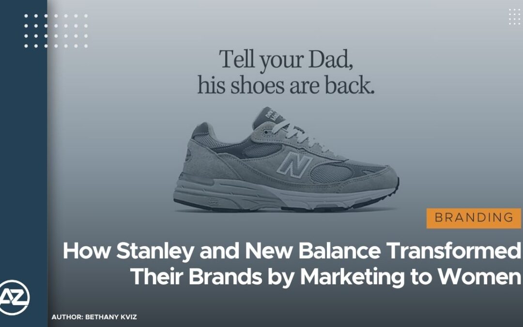
How Stanley and New Balance Transformed Their Brands by Marketing to Women
AZEE Branding SolutionsIn today's fast-paced market, brands that once catered primarily to men have found massive success by shifting their focus to women. Through social media, influencer marketing, and strategic rebranding, companies like Stanley and New Balance...

The NBA All-Star Game Is Broken: Here’s How to Fix It Before Fans Stop Caring
AZEE Branding SolutionsThe NBA All-Star Game, once a thrilling showcase of the league’s best talents, has become little more than a glorified layup line. The lack of defense and competitive spirit has left fans and analysts alike yearning for something more...