AZEE Branding Solutions

Hey there, branding enthusiasts. today we’re diving deep into the energetic world of Rockstar Energy Drink’s latest rebrand. Pepsico shelled out a cool $3.85 billion in 2020 to acquire the brand, and now they’re giving it a fresh look to jolt some life into its market presence. Let’s dissect the highs and lows of Rockstar’s revamped identity.
First off, kudos to Pepsico for recognizing the need for a rebrand when the brand is feeling a bit sluggish. In a sea of energy drink options, standing out is no easy feat, and a visual facelift can be just what the doctor ordered. The energy drink market tends to lean towards darker colors, high contrast graphics, and heavy typography, portraying an extreme vibe associated with the product. However, Rockstar is taking a different route, and I must say, it’s delightfully anti-energy drink.
The recognizable star logo with the mirrored double R is still there, but it’s been downsized to give more space to the Rockstar wordmark. The can’s surface area, once a riot of multi-colored illustrations, has been dialed back to share space with more solid colors. The result is a can that retains its fun essence but feels a bit more restrained.
Now, what I appreciate is that they’re steering away from the extreme sports visual language and targeting a “social igniter” demographic. The emphasis on activities like dancing, enjoying live music, playing sports, and socializing aligns with the brand’s goal to cater to a broader audience. Plus, the move towards low-sugar options is a smart play, especially in an era where energy drinks are under scrutiny for marketing towards children.
However, my dear branding aficionados, here’s where the “Brand Daddy” becomes a bit discerning. The design, in my opinion, is a tad too busy. In a time where clean, crisp, and legible designs are trending, Rockstar’s visual identity falls short for me. Red Bull has mastered the art of simplicity, and even newcomers like Prime have embraced a clean and crisp design. While the strategy and timing of the rebrand resonate with me, the execution feels a bit cluttered.
In the grand scheme of things, I’d give this rebrand a solid C+. Beauty is subjective, and art varies in the eyes of the beholder. While many might love the energetic burst of the new look, this one doesn’t quite hit the sweet spot for the me. The idea and strategy are on point, but the devil is in the design details. Let’s see if this visual overhaul gives Rockstar the push it needs in the competitive energy drink arena! 🚀
And as we’re all about transparency and authenticity here at AZEE Branding Solutions, let me give my personal take on the rebrand. While the execution may not entirely align with my design preferences, it’s a bold move that showcases the brand’s willingness to evolve and adapt. Change is part of the branding journey, and I’m intrigued to see how this transformation unfolds in the market. Cheers to the dynamic world of branding!

Connect With Us!
Connect with us today to discover how we can help you grow your brand from A to Z
Related Articles
Caitlin Clark Is Out…Now We Find Out If the WNBA Was Ever Really In
AZEE Branding SolutionsThe 2025 WNBA All-Star Weekend will be the moment of truth. It will reveal, for better or worse, whether the WNBA has actually built something sustainable from Caitlin Clark’s once-in-a-generation momentum or whether they’ve simply been riding...
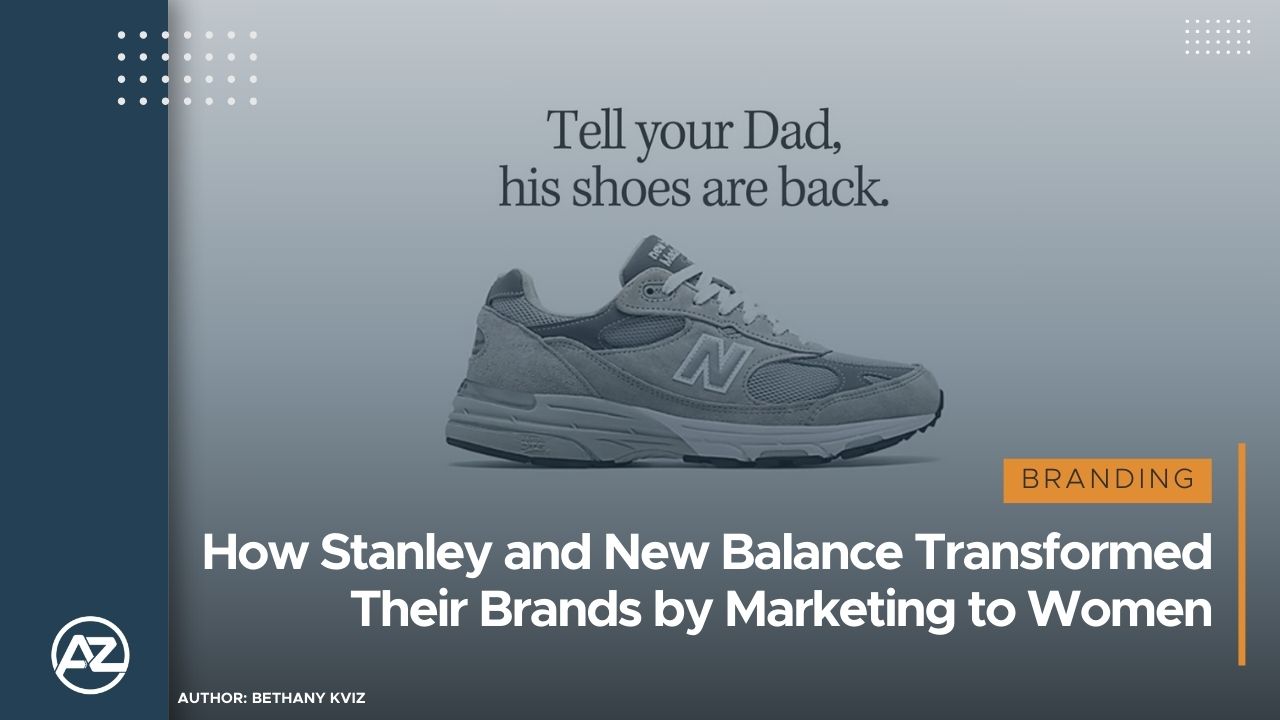
How Stanley and New Balance Transformed Their Brands by Marketing to Women
AZEE Branding SolutionsIn today's fast-paced market, brands that once catered primarily to men have found massive success by shifting their focus to women. Through social media, influencer marketing, and strategic rebranding, companies like Stanley and New Balance...

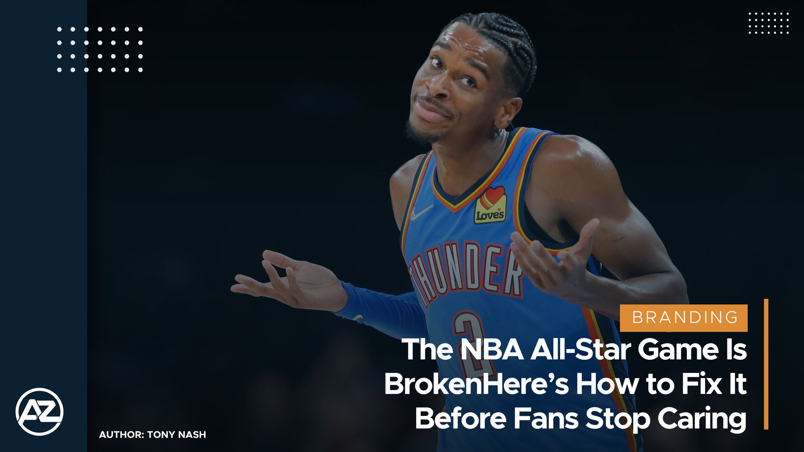
The NBA All-Star Game Is Broken: Here’s How to Fix It Before Fans Stop Caring
AZEE Branding SolutionsThe NBA All-Star Game, once a thrilling showcase of the league’s best talents, has become little more than a glorified layup line. The lack of defense and competitive spirit has left fans and analysts alike yearning for something more...