
AZEE Branding Solutions

Hey there, branding enthusiasts! It’s time to drop some knowledge/opinions on the LA Clippers’ recent rebrand. The sports world and even the mains stream media are talking about it, and you know I had to weigh in on this wave-making move.
First off, big kudos to the Clippers for shaking things up. The moment Steve Ballmer stepped onto the scene in 2021, you could sense change was a-brewing. Fast forward to now, and we’re talking about a whole new logo, jerseys, and even a peek at the Intuit Dome court. The Clippers aren’t just playing basketball; they’re crafting an identity, and I’m all about it.
Let’s talk threads – the new uniform lineup brings back the red colorway, something the fans missed. I’m vibing with the “Statement” uniform, those nautical flags spelling out “LAC” on the side are a slick nod to the team’s history. And script lettering is back, baby! It’s like a blast from the past, and it’s about time. Ditching the black uniforms for now? Smart move. We’re entering a new era; let’s bring in fresh colors.
Now, the global logo – it’s a mixed bag for me. The compass connected to the ship is a cool metaphor for always moving forward, but I can’t shake the feeling it’s a tad busy. Maybe a sailing ship could’ve added a smoother touch, but hey, you can’t have it all.
The educational side – did you know the Clippers are named after ships from the mid-1800s? I didn’t either. It’s a nice history lesson, but do we really need it? I’m on the fence.
Court design? Top-notch. Inglewood’s longitude and latitude? Sweet touch. Compared to the 2015 attempt, this rebrand is leagues ahead. It aligns with the team’s name and history, and that’s a slam dunk.
But here’s where I get real – the logo, as a whole, doesn’t scream “basketball team” to me. It’s doing a bit too much. It’s reminiscent of the Milwaukee Bucks rebrand of 2015. The compass and ship are cool, but simplicity matters in a basketball logo. Sometimes, less is more.
Despite my nitpicks, I gives the LA Clippers’ rebrand a solid B-, while still applauding the homage to the team’s founding, the return of classic elements, and the timely change with the new arena. While there are reservations about specific design choices, overall, the Clippers’ brand journey receives a favorable nod from The Brand Daddy. So, what’s my verdict? They paid homage to their roots, brought back some classics, and timed it right. Bravo, Clippers. Now, let’s see if this rebrand helps you catch that Larry O’Brien Trophy wave next June at the Intuit Dome!

Connect With Us!
Connect with us today to discover how we can help you grow your brand from A to Z
Related Articles
Caitlin Clark Is Out…Now We Find Out If the WNBA Was Ever Really In
AZEE Branding SolutionsThe 2025 WNBA All-Star Weekend will be the moment of truth. It will reveal, for better or worse, whether the WNBA has actually built something sustainable from Caitlin Clark’s once-in-a-generation momentum or whether they’ve simply been riding...
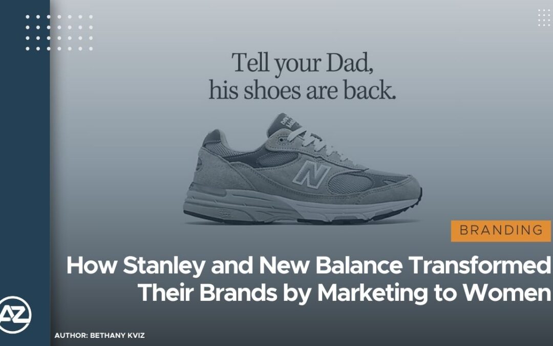
How Stanley and New Balance Transformed Their Brands by Marketing to Women
AZEE Branding SolutionsIn today's fast-paced market, brands that once catered primarily to men have found massive success by shifting their focus to women. Through social media, influencer marketing, and strategic rebranding, companies like Stanley and New Balance...

The NBA All-Star Game Is Broken: Here’s How to Fix It Before Fans Stop Caring
AZEE Branding SolutionsThe NBA All-Star Game, once a thrilling showcase of the league’s best talents, has become little more than a glorified layup line. The lack of defense and competitive spirit has left fans and analysts alike yearning for something more...